|
|
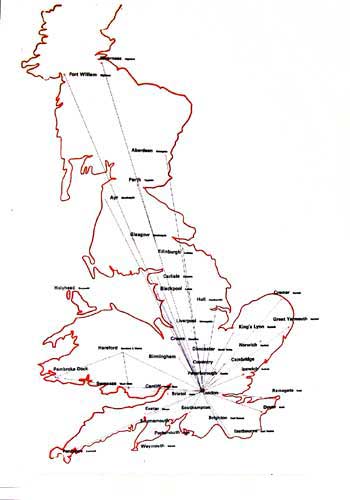
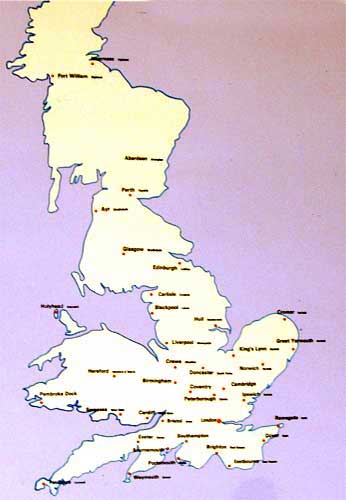
Why are maps based on distance?It isn’t always important. Travelling time can matter more. In non-technological societies people don’t say how far a destination is as distance, but how long it takes to get there. “Riyadh? It’s nine hours.” That makes more sense! I set out a skeleton map of the mainland, with travelling distance by train as the index. The first step was to plot some major destinations and adjust the coastline. |
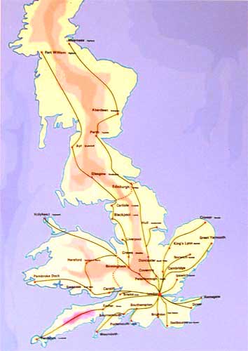
Once the coastline had been adjusted, the colour coding could be added.Britain has acquired a new shape—one that travellers could find highly useful. The slower travelling times in Scotland confer an elongated profile (indeed, Scotland disappears off this map altogether). The main-line routes to the north-west, South Wales and the south coast ports show how the effect of train travel drags these provincial cities towards London. |
|
|
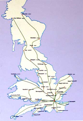
The next stage was to add provisional routes for the mainline services.This gives an instantly-assimilable idea of travelling times, which are often very different from distance in miles or kilometres. But the relative positions of towns and cities has changed - aand so has the coastline to mnatch. |
Look: Perborough is closer to London than CambridgeExeter is nearer than Weymouth, Brighton much closer than Eastbourne. For anyone planning a journey by rail, this kind of map immediately provides a guide to the journey time. |
|
|